
機械学習を行った際、学習が上手く行ってるか確認したい場合があります。その際、簡単にパフォーマンスを可視化するライブラリとして「Yellowbrick」があります。
ここでは使用方法をまとめています。
この記事の対象
Yellowbrickとは
「Yellowbrick」とは機械学習の実行した結果を可視化するライブラリになります。
ちなみに、単純なデータを可視化するライブラリには「Seaborn」というものがあります。Seabornについては以下をご参考下さい。
Yellowbrickは、外部ライブラリなので以下の様にpipでインストールしておく必要があります。
$ pip install yellowbrick 「Yellowbrick」を用いた使用例
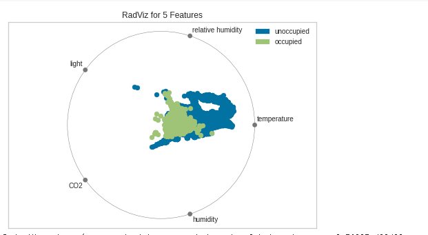
多変量データ視覚化(RadViz)
from yellowbrick.features.radviz import radviz
from yellowbrick.datasets import load_occupancy

#Load the classification dataset
x, y = load_occupancy()

# Specify the target classes
classes = ["unoccupied", "occupied"]

# Instantiate the visualizer
radviz(X, y, classes=classes)
結果
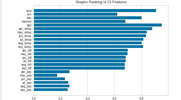
棒グラフ(Rank 1D)
from yellowbrick.datasets import load_credit
from yellowbrick.features import Rank1D

# Load the credit dataset
X, y = load_credit()

# Instantiate the 1D visualizer with the Shapiro ranking algorithm
visualizer = Rank1D(algorithm='shapiro')

visualizer.fit(X, y)           # Fit the data to the visualizer
visualizer.transform(X)        # Transform the data
visualizer.show()              # Finalize and render the figure
結果